Responsive Web Design
If your wondering how to make your website responsive, we offer responsive (mobile & tablet friendly) website designs for businesses in Belleville, Hamilton, and worldwide. Responsive web design is growing faster worldwide and we want to help make sure your business remains innovative in your industry.
Why Go Responsive? 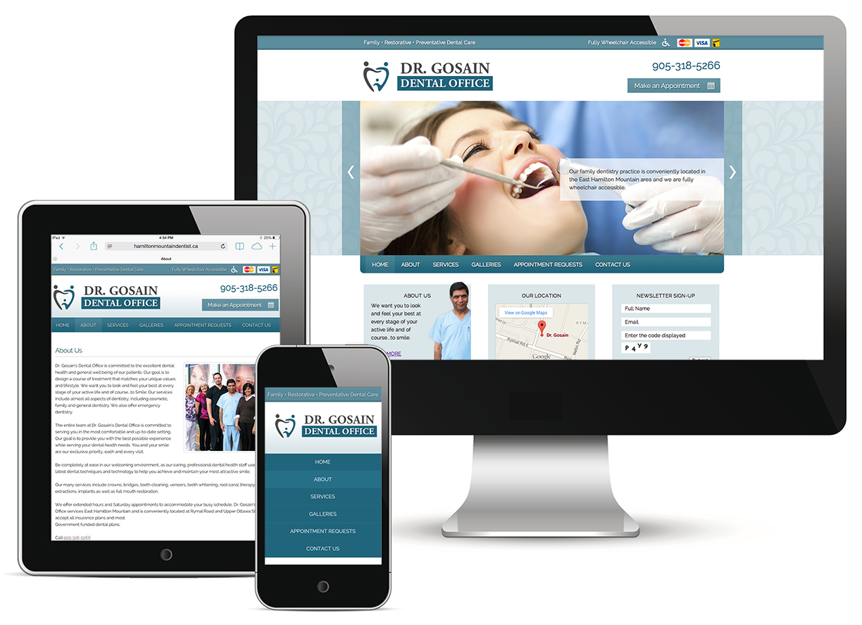
A responsive design responds to the needs of todays user. The content layout of the website changes according to the user device so that it is ledgable and easier to navigate. Images and text adjust automatically to smaller devices and hide unnecessary images so that important information can be dislayed for the user to see. Google owns 67% of search market share and refers to responsive design formatting as the industry best practice and the recommended mobile configure. You can tell if a website is responsive on a desktop by reducing the full screen size to the minimum screen size.
The key features of a responsive site:
- Content automatically adjustable to user device
- Navigation is condensed
- Images are optimized
- Correct padding and spacing
You should go responsive if:
- You have a site with complex content and features that are difficult to use on a mobile device
- You want your website to be user friendly for all users and not restricted to desktop users
- You want one website that works with all devices and is easier to manage
- You want google to crawl index and organize your content in a more efficient manner